Glenmorangie “Once Upon A Time”
Campaign (Spec)
A digital-first campaign concept designed to turn premium brand storytelling into participation across social, OOH and experiential touchpoints.
Project Overview
A speculative campaign response built around the prompt “Once Upon A Time…”, inviting people to write a short line about a father figure or mentor.
The concept uses copy-led creative and a QR-to-mobile journey to turn attention into action, while keeping the tone premium, understated and scalable across formats.
Create a campaign that felt emotionally intelligent and platform-native, while staying restrained, legible and flexible across social, OOH and retail environments.
The idea needed to move beyond awareness and give people a reason to actively engage.
The Challenge
I led the concept and visual system end-to-end, including:
My Role
Campaign concept and platform development
Paid social creatives
Mobile landing journey
OOH / DOOH adaptations
Visual direction and testing logic
Supporting spatial extensions
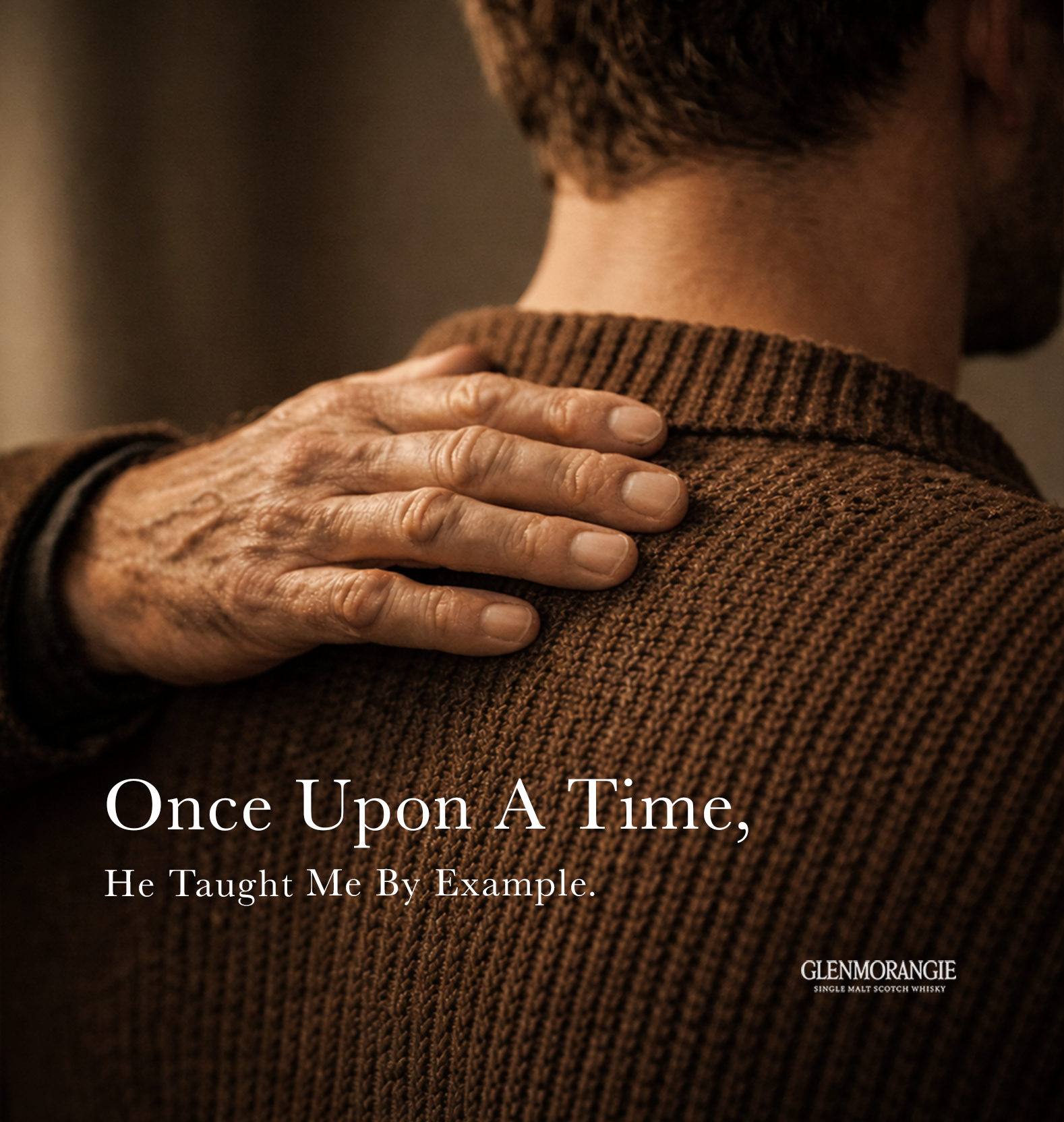
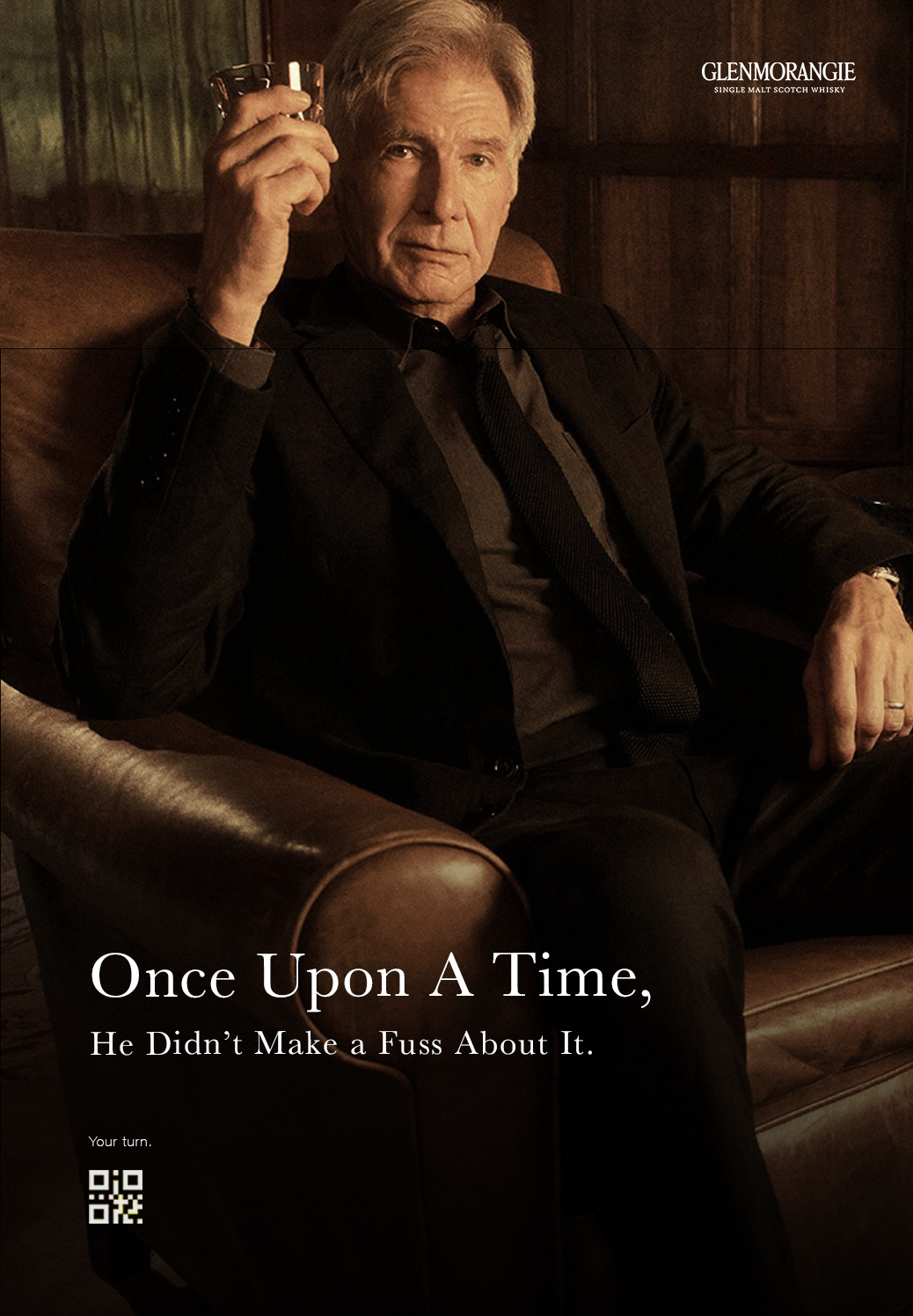
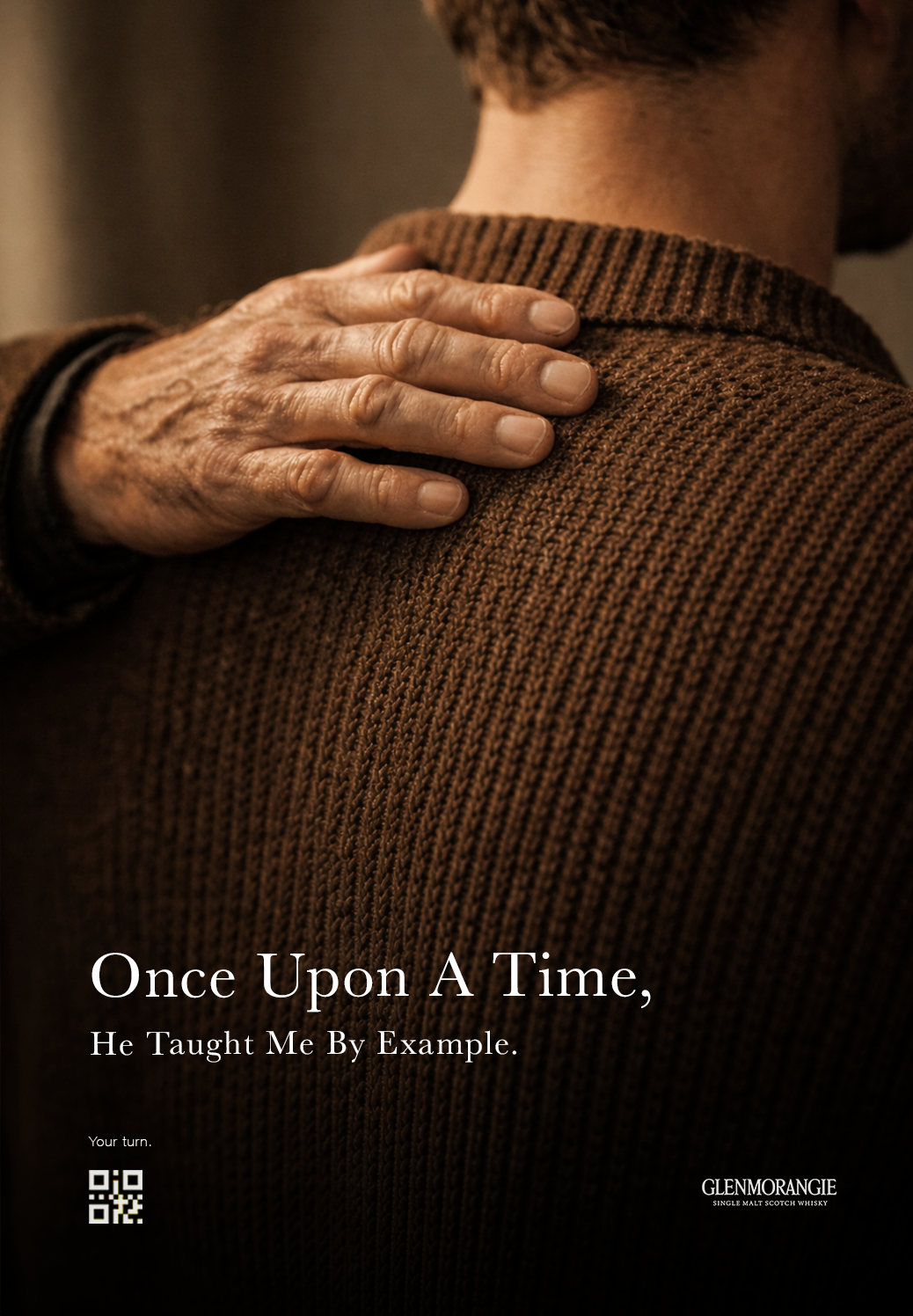
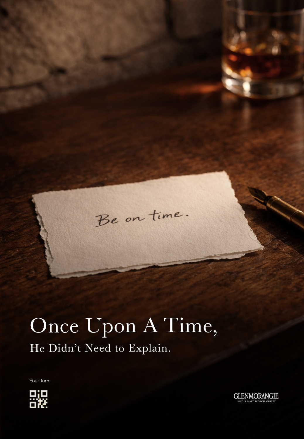
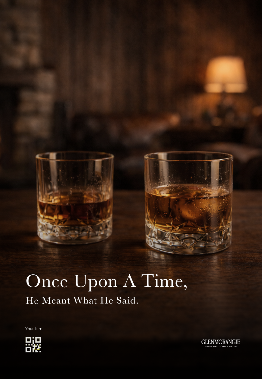
A short, elegant line becomes the entry point:
The Idea
“Once Upon A Time, He…”
Each execution invites the viewer to continue the sentence - “Your turn.” - leading into a mobile-first submission flow.
Selected lines could then feed back into social and OOH, turning participation into an evolving campaign system rather than a one-off message.
Campaign Rollout
The platform was designed to work across multiple touchpoints:
OOH to establish the world and keep the brand visible
Social to adapt the idea into swipeable storytelling
Mobile to turn attention into submission
Experiential to extend the world into a more personal rit
Social Rollout
To show how the idea could live natively on social, I adapted the campaign into a swipeable Instagram sequence.
The carousel moves from hero storytelling to emotional variation, then into a clear participation prompt and mobile action — helping the campaign feel like a system rather than a single visual.
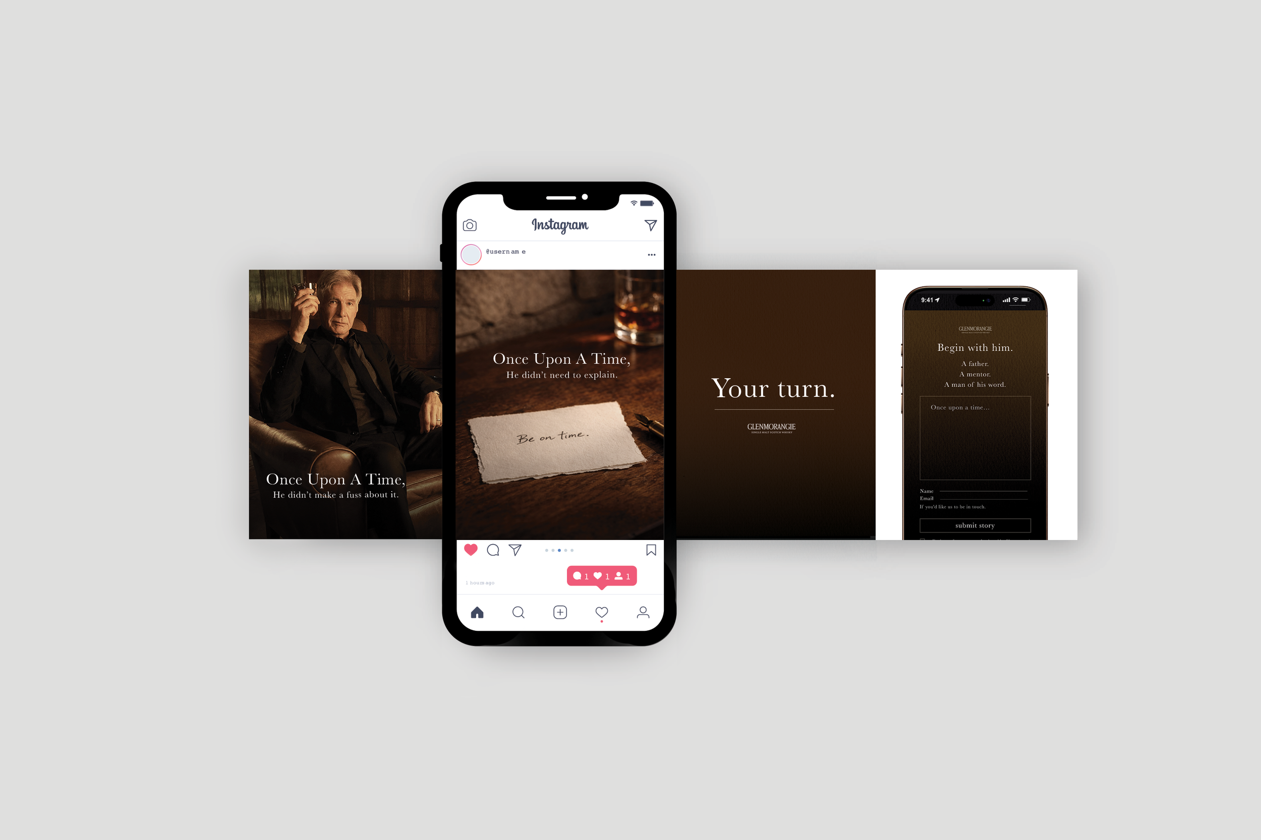
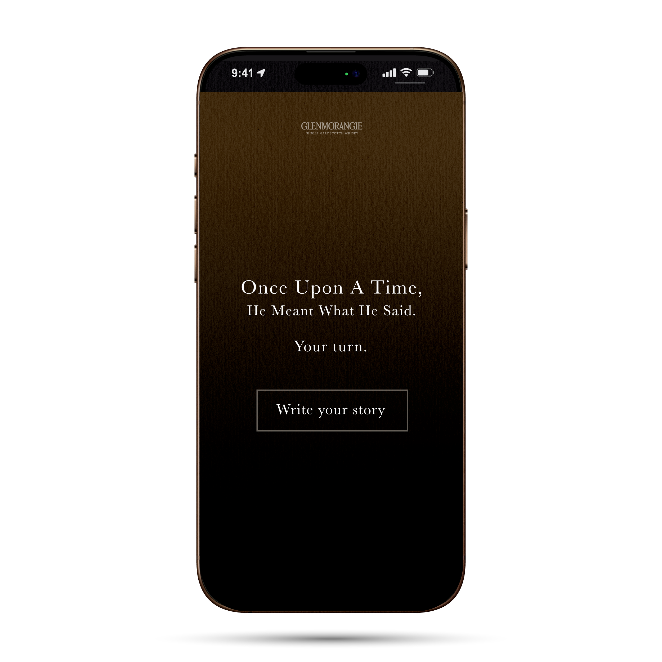
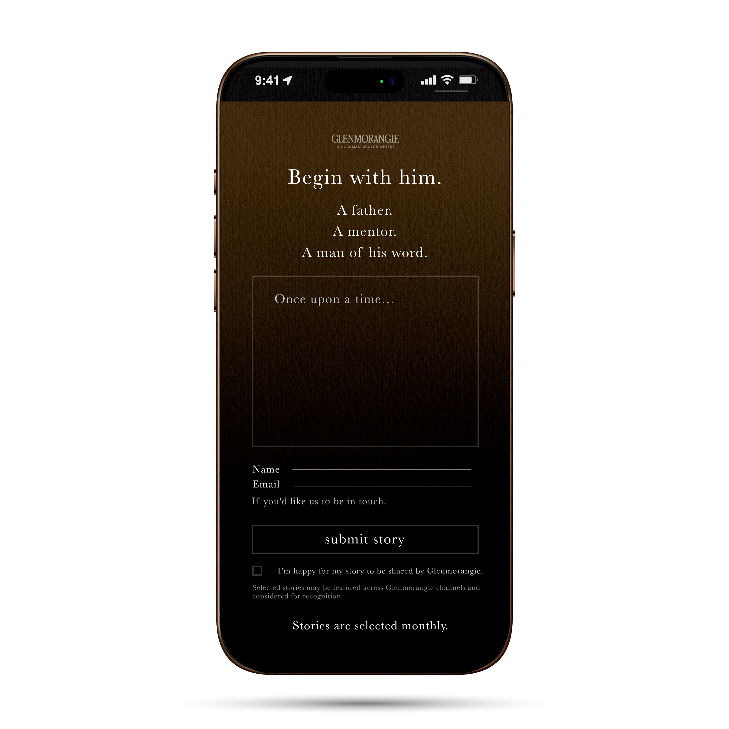
Mobile Journey
To support the QR mechanic, I developed a simple mobile-first submission flow that carried the same visual tone into the digital experience.
The aim was to keep the journey minimal and low-friction, moving users from campaign awareness into story submission without breaking the mood of the brand world.
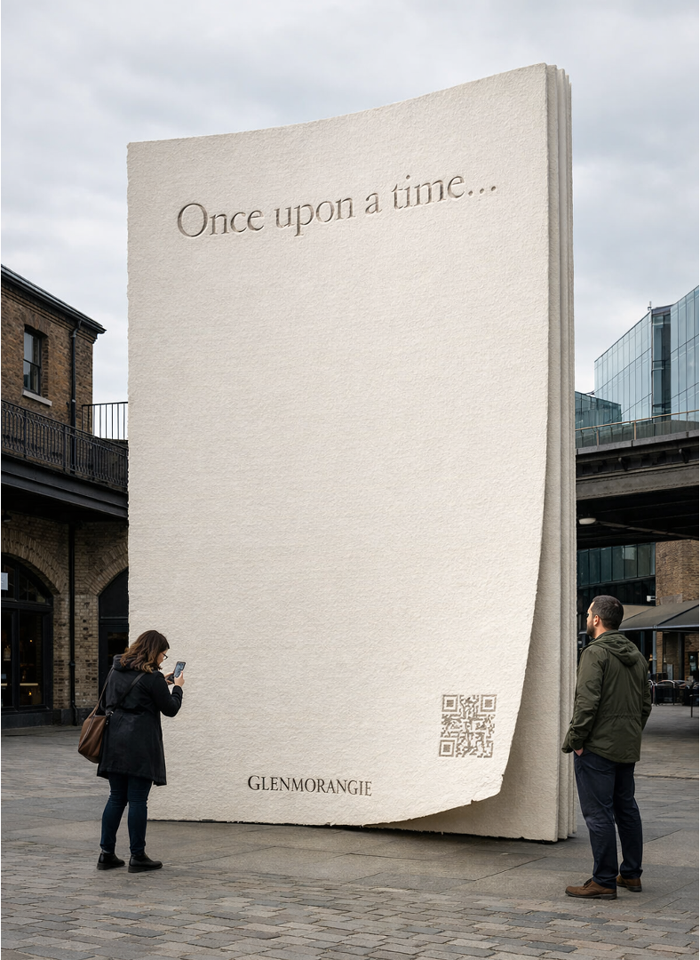
Spatial Extensions
To explore how the platform could move beyond media, I developed two physical extensions of the idea.
The Writing Room brings the story into a more intimate retail setting, while The Monumental Page scales it into a larger public moment designed to drive participation during Father’s Day weekend.

Visual Direction
The visual language was rooted in Highland provenance, material authenticity and masculine restraint.
Dark oak, brass, textured paper and warm amber light created a world that felt quiet, grounded and emotionally intelligent - balancing premium craft with modern campaign clarity.
What I Would Test
If taken further, I would test different “He…” hook lines, CTA language, layout hierarchy and scan-to-submission flow.
The goal would be to understand which combination of message, pacing and placement drives the strongest response across social, OOH and mobile.
Note
This project was created as a speculative campaign response for pitch purposes and was not produced.